Why Most Creators Get It Wrong?
Almost every YouTuber, designer, or social media creator has used arrows.
And almost everyone has asked the same question at some point: “My thumbnail looks fine… so why isn’t anyone clicking?”
This is where arrows usually enter the picture. Someone says, “Add an arrow, it boosts CTR.”
So you add one. Maybe two.
Nothing changes.That’s not because arrows don’t work. It’s because most arrows are used without intention.
The Problem Isn’t the Arrow.
The real problem is this: Arrows are treated like decoration instead of direction. When a viewer sees a thumbnail, post, or ad, they don’t “analyze” it. They scan it And in that first half-second, your arrow either:
- quietly guides the eye, or
- adds one more thing to ignore
There’s no middle ground.
The Only Question That Matters.
Before placing any arrow, ask yourself: “Where do I want the viewer to look first?”If you don’t have a clear answer, the arrow will not help you.
Most low-CTR designs fail here — not because they’re ugly, but because they ask the viewer to decide what matters.
Viewers don’t want to decide.They want to be guided.
Arrow Styles That Actually Help (When Used Right).
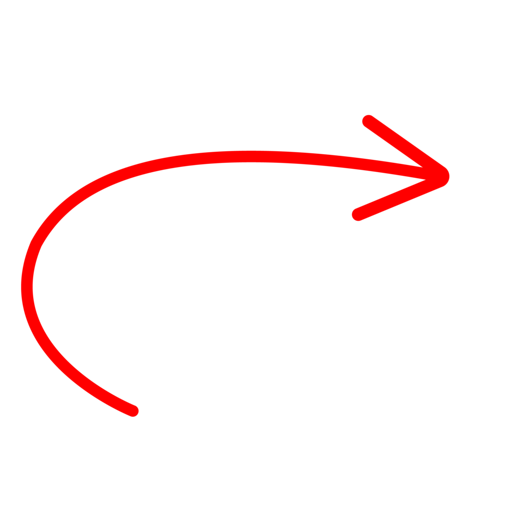
Curved Arrows: Natural Attention Flow
Curved arrows feel human. They don’t shout — they lead.They work especially well when:
- you’re pointing to a facial expression.
- you want the eye to move naturally across the image.
If your content is reaction-based or emotion-driven, curved arrows usually outperform straight ones.
Hand Pointers: Clear Action Signals
Hand pointers feel familiar because we’ve seen them everywhere — buttons, websites, tutorials.They work best when the message is simple:
- Click this.
- Tap here.
- Focus on this action.
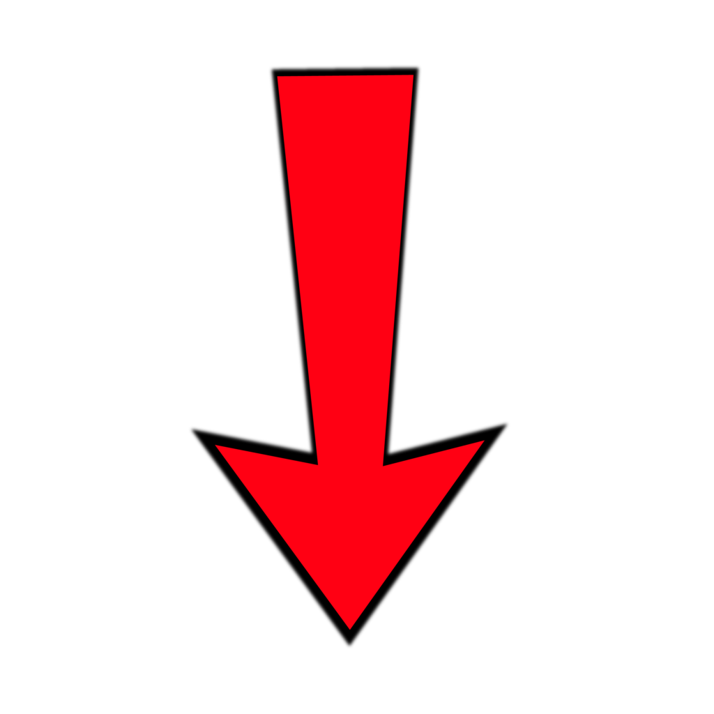
Bold Arrows: Use Carefully
Bold arrows are powerful — and risky. They’re great when:
- Urgency matters
- The offer is time-sensitive
- You need attention instantly (especially on mobile)
But overuse them, and your design starts to feel pushy.Once trust drops, CTR usually follows.
Minimal Arrows: Quiet but Effective
Minimal arrows don’t try to impress.They’re good when:
- The design is already strong.
- You want a clean, professional look.
- The audience expects quality, not hype.
They may not create dramatic spikes — but they help consistency.
Where Arrows Help — And Where They Hurt
When Arrows Work
- Guiding attention to emotion, not text.
- Leading the eye inside the frame.
- Simplifying what matters most.
When Arrows Hurt
- Pointing at something obvious.
- Competing with multiple visual elements.
- Being added “just in case”.
If the arrow doesn’t reduce thinking, it usually reduces clicks.
Color Matters More Than Most People Think.
People often choose arrow colors based on preference.Viewers respond based on contrast.A simple rule:
- If the arrow blends in, it’s invisible.
- If it overpowers everything, it feels aggressive.
The goal is balance — noticeable, not dominant.


How Designers Should Think About Arrows?
Good design looks nice.Effective design moves people.When arrows are placed with intention:
- Attention becomes predictable.
- Testing becomes easier.
- Results become repeatable.
That’s what clients care about — not how stylish the arrow looks.
The Real Takeaway.
Arrows don’t magically increase clicks.They work when they:
- Remove confusion.
- Guide the first glance.
- Support the main idea.
Used well, they feel invisible and used poorly, they feel loud.
Conclusion:
If you ever feel unsure about adding an arrow, try this:
Remove it.
Then add it back only if it clearly improves focus.
Most high-performing designs are simpler than you think.